(Portfolio)
03 / 08
← All projects
Ana Pio
About the project
(Context)
Ana Pio believes architecture shouldn't be complex, distant or out of reach. With a close, solution-oriented approach, she guides each client with clarity, from concept to construction.
(Concept)
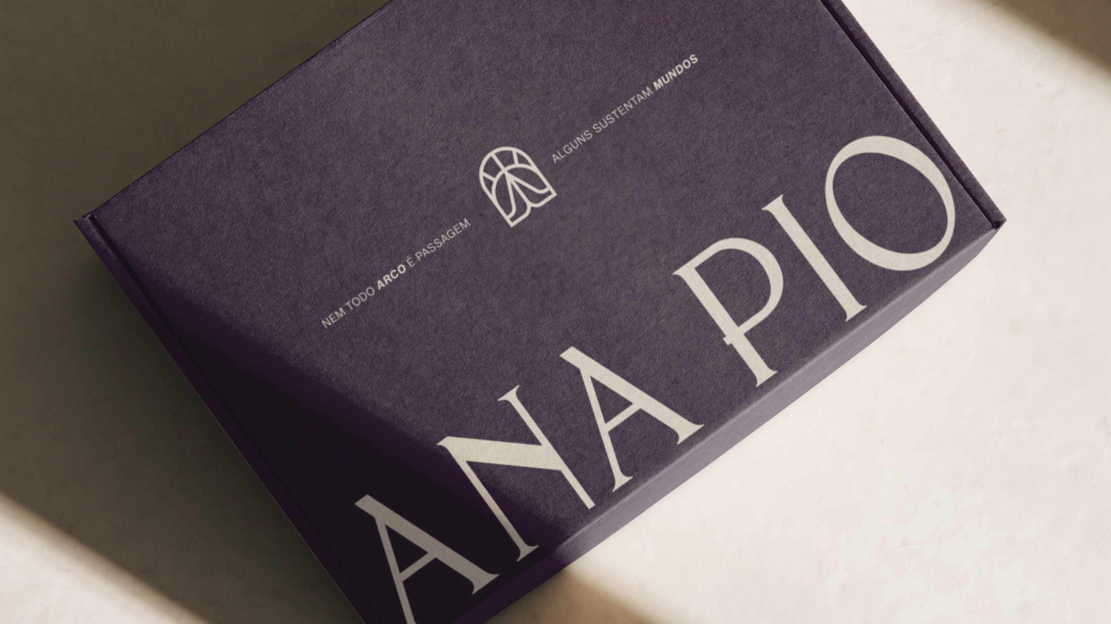
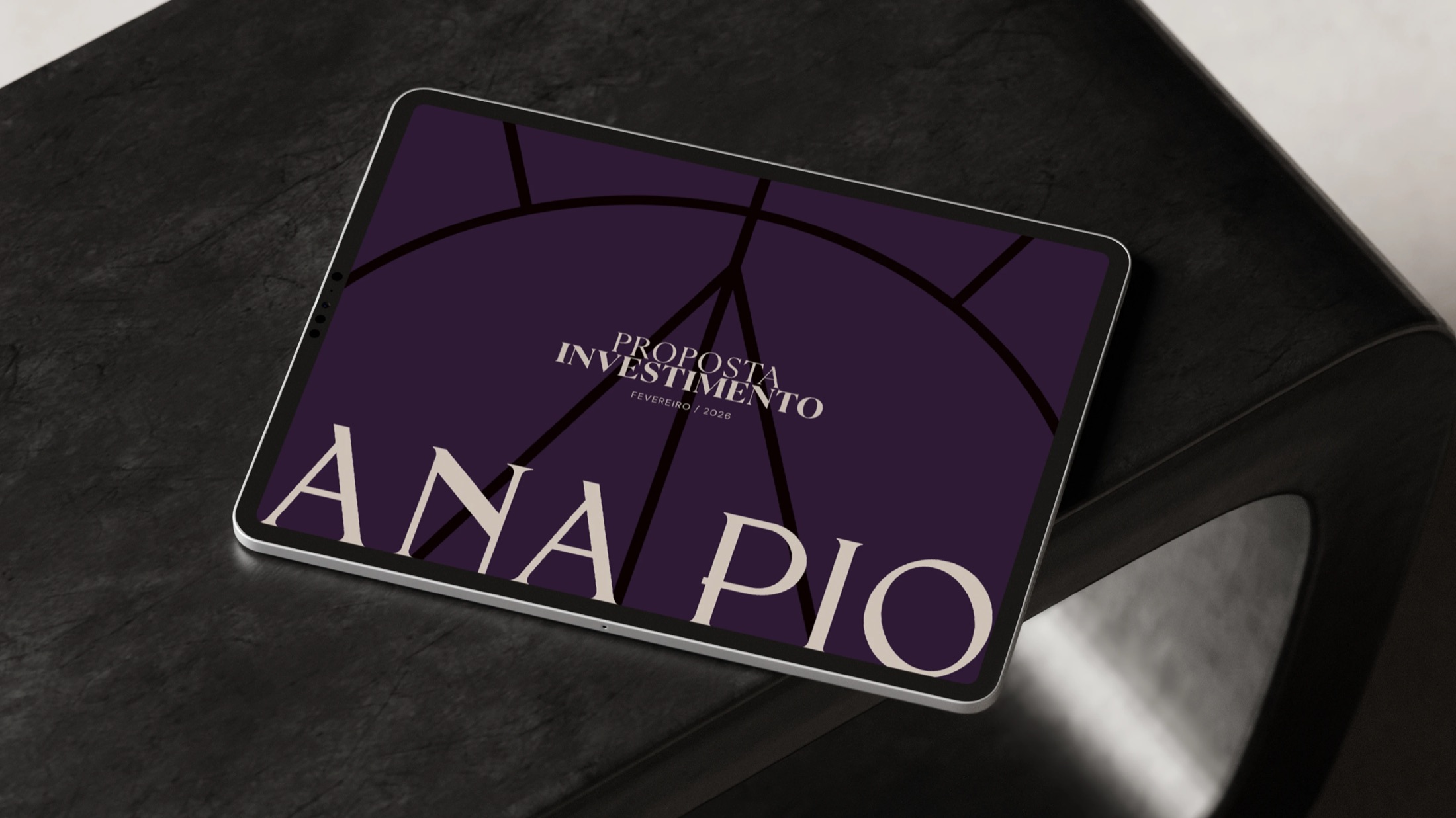
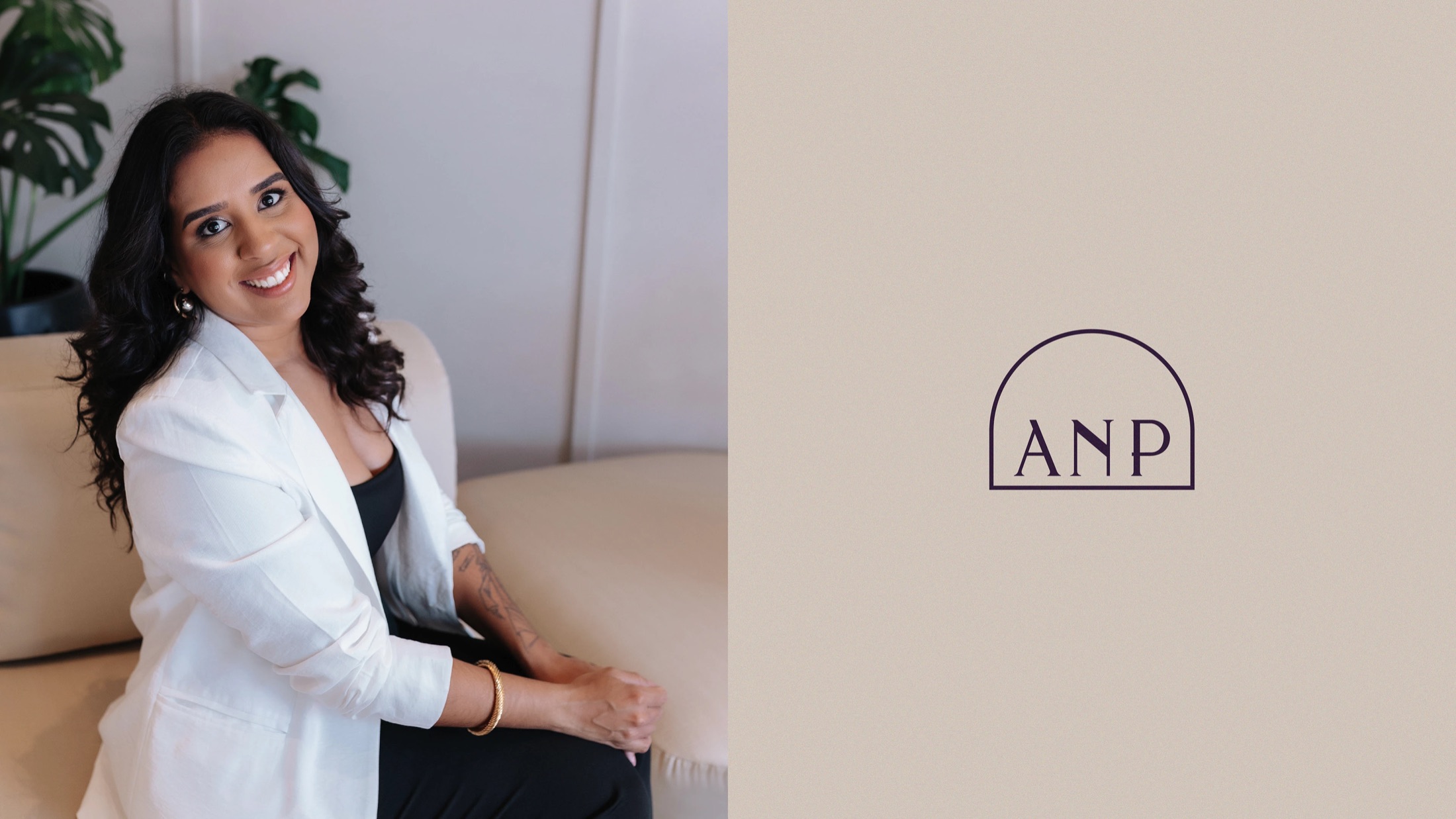
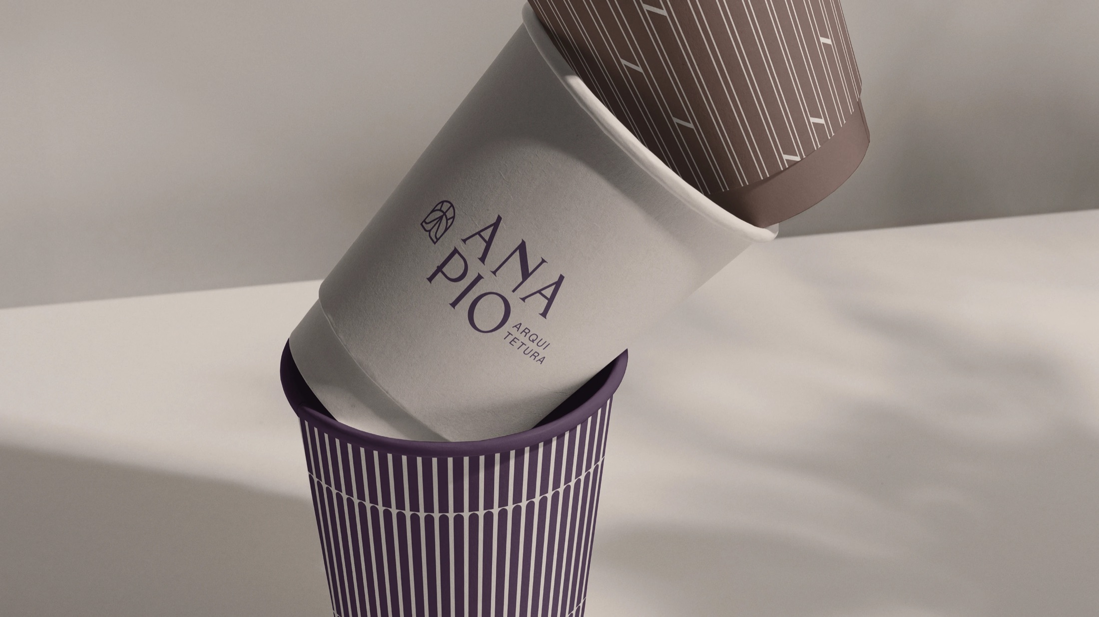
Inspired by the portico and the portal, the symbol represents passage, direction and beginning: structural elements that support and guide, just like Ana's work.
“Gaby didn't just create a brand, she put into words who I am.”

Tons Design®
It's not just about design: it's clarity, authority and positioning. It's the ability of a professional to recognize herself and be recognized.