(Portfolio)
01 / 08
← All projects
Lorrainy Sá
About the project
(Context)
She already had the knowledge and the care. What was missing was a brand to match: the previous identity didn't convey the maturity and precision clients found in the day-to-day of each project.
(Concept)
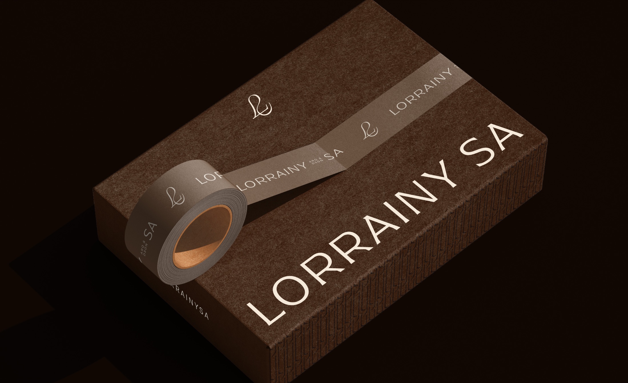
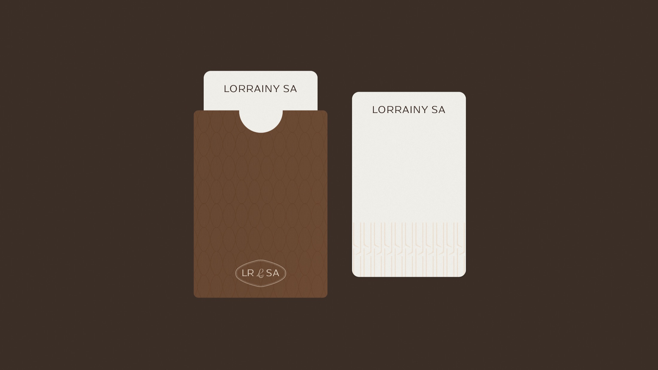
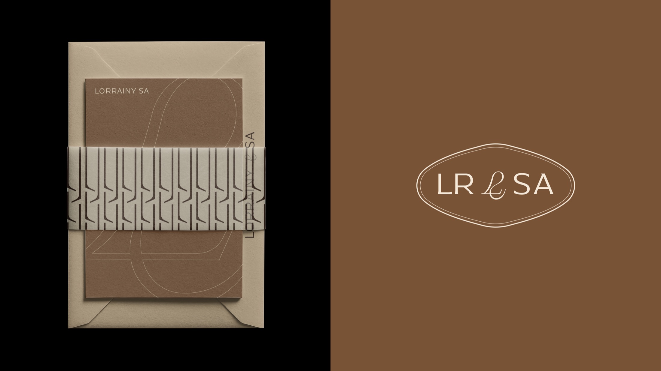
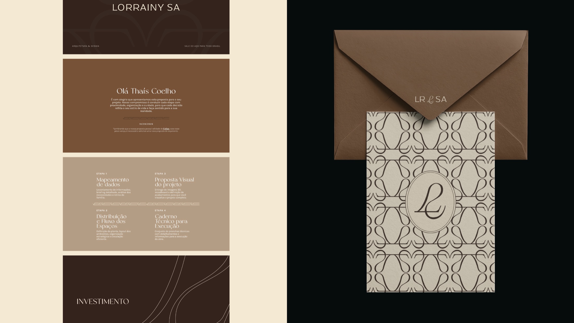
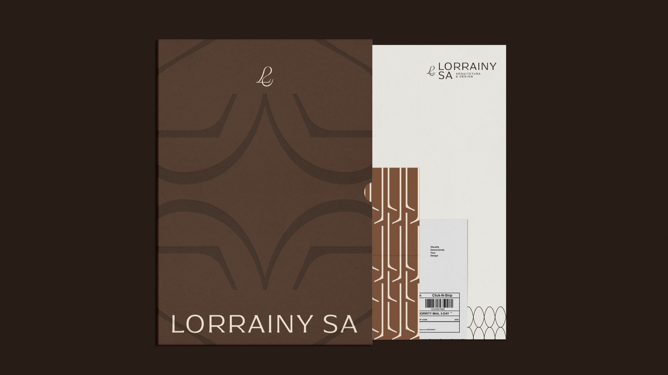
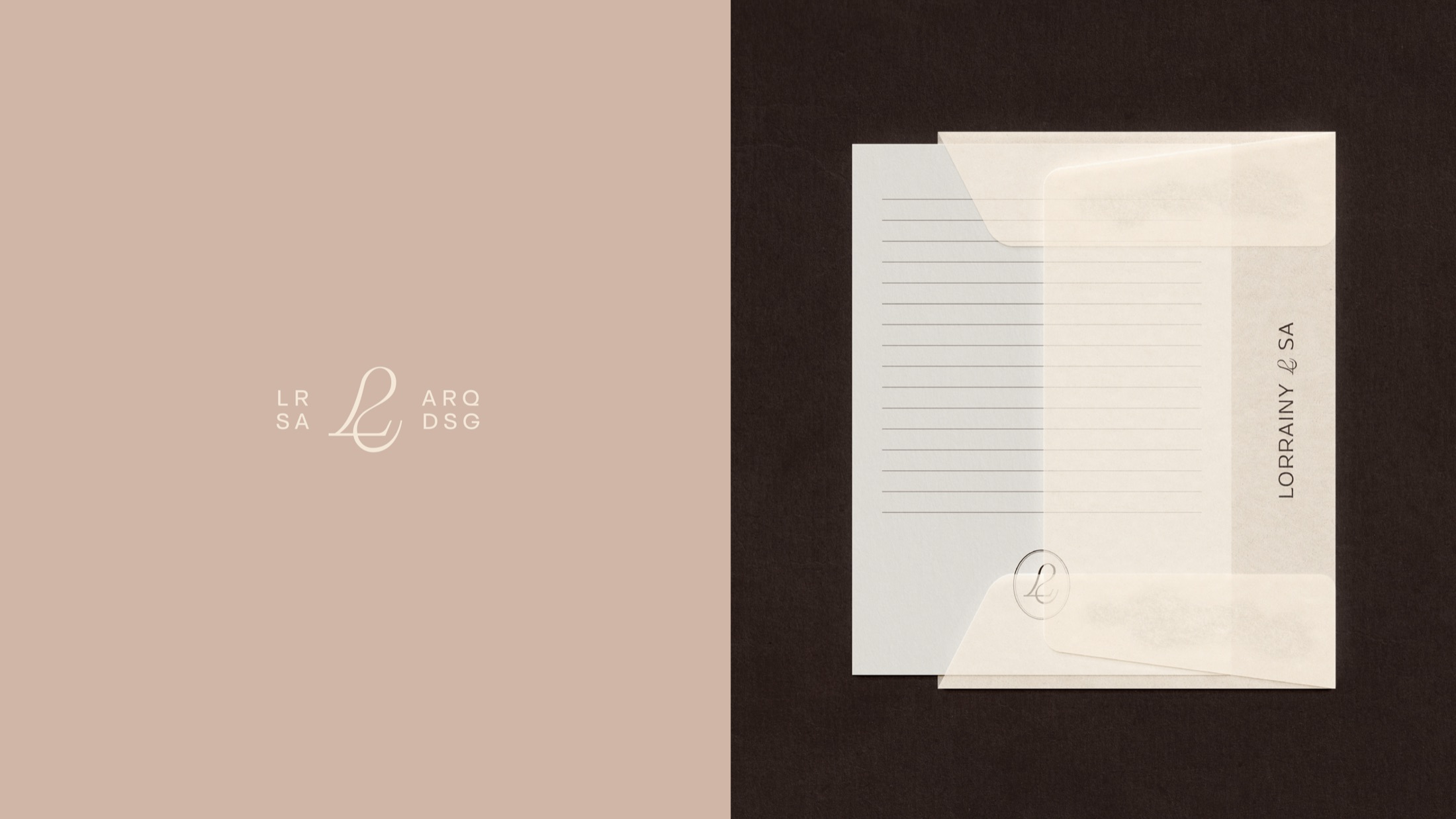
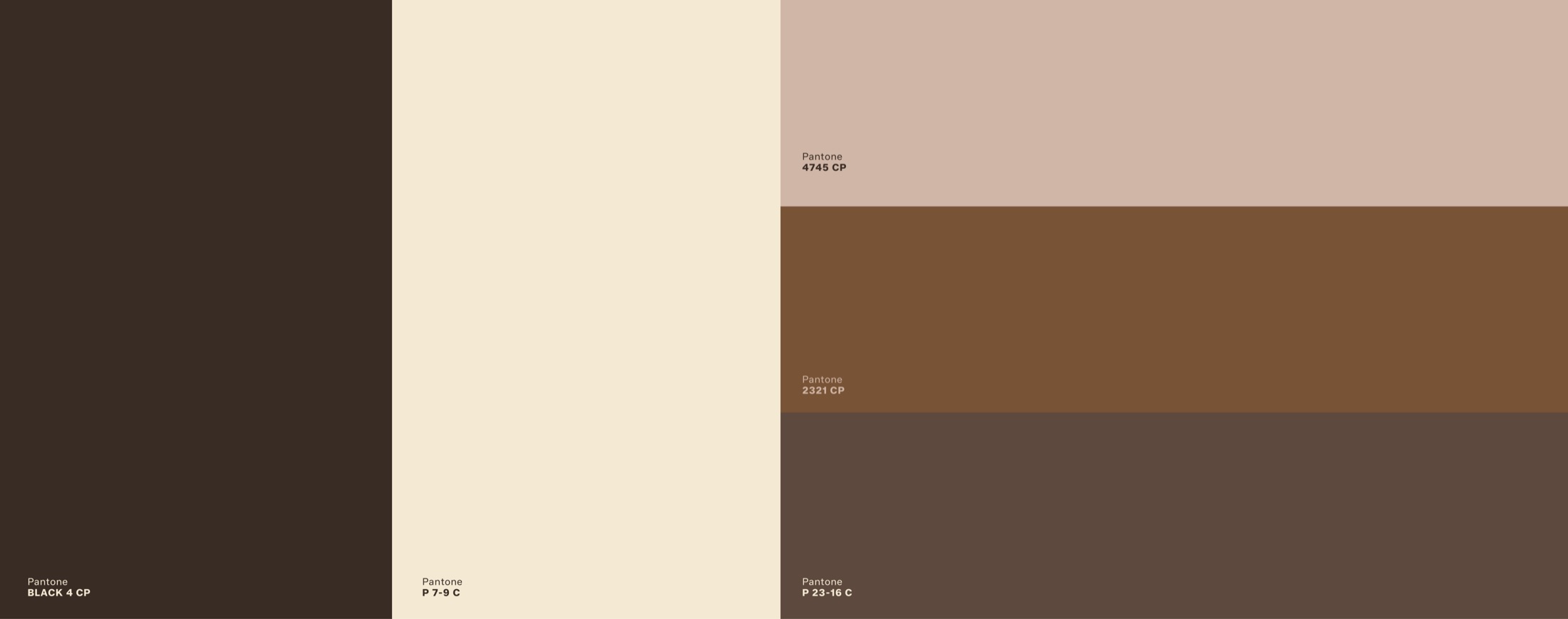
Inspired by Art Nouveau, the new brand intertwines the L and the S in a single gesture, with colors drawn from fine woods and home textiles. Firm in what it delivers, delicate in how it delivers.
“Gabi is exceptional! This is the second time I've hired Tons to develop the visual identity for my architecture practice.”
Tons Design®
It's not just about design: it's clarity, authority and positioning. It's the ability of a professional to recognize herself and be recognized.